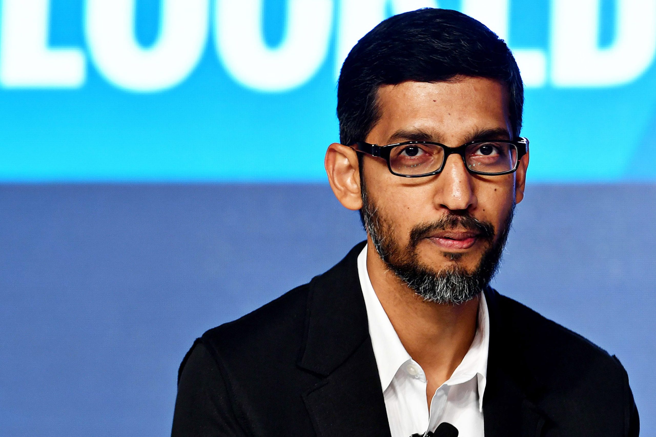
Archive for: design
Hermes a French design firm has partnered with Monaco based ship builder Wally to create the ‘WHY 58×38,’ a craft that will cost around £90million to build.
Naval architect Mauro Sculii said: ‘The advantage of travelling on the WHY boat is that you take your own space with you, your house, your island so you are not in a hurry to arrive, you just have the pleasure of travelling and being on board. That’s the novelty. Usually a boat is just a means of transport.’


There has been a lot of talk recently about the new PS3 Slim, but we have just come across a completely new design from Tai Chiem, this 3D model will surely make all the gizmo freaks drooling spit all over the place.
From the basic images it seems as thought the designer believes that the next PS4 will have an OLED screen.


“I’m not a blogger. I just tweet a lot”.

It’s true. I’m not a blogger and I do tweet a lot. That’s why I’m about to place an order for a t-shirt that says exactly that from Threadless.com. They have just opened up a new twitter branch of their website that takes popular, funny and strange tweets and makes t-shirts out of them. Pretty cool ones I might add.
Basically, people submit tweets to them or they find the tweets. If they think they’re funny or interesting they’ll make a cool t-shirt out of them. The price of a t-shirt is $18 before shipping and their available in sizes from small to Extra Extra Large for our small or large tweeters. They’re also available in both man and women sizes.
I think it’s a cool idea. There are hundreds and thousands of people using Twitter every singe day and I’m sure that a proportion of them are as nerdy as me and as such will see it fit to buy several T-Shirts that say “140 is the new 420”.
There is also a chance to make some cash. If you nominate a tweet that gets printed you can get your hands on $140. Furthermore, if you submit your own tweet that gets printed you will make $500. Not bad for a little bit of tweeting. Below are a couple of my favourite tees I seen at Threadless.


Do you feel like you need a website and you have no money to create one? And you are not a developer nor a web designer to do it yourself? Well I’m pretty sure that the your next step should with Moogoo.
Moogoo is the quick choice to take when it comes to design easy and very acceptable websites and it only takes a few moments to complete. You will have several options to add different type of functionality to your site, so it won’t be the same static content. Besides doing all the design work, you can find more features:
- Free option available and with interesting features.
- Payed option includes the completeme management of the website.
- Registered domain names supported. That means if you have your own domain name, like mycompany.com, you will have support to migrate the website to your own domain without having any type of problems.
- Features that you can use in your website: News, photo albums, blogs, events, quick polls, statistics, search engine, etc.
- Web base e-mail option available.
To check on more features available, check this link.
As an important note, the payed versions are two: Personal ($4.99) and Business ($14.99). Not bad, right?
Have you been looking for some great design inspiration for your next project? Well look no further than The Design Inspiration. The Design Inspiration has been created by a group of designers who have been looking for quality design ideas from all over the internet. The Design Inspiration features some of the best logo designs, illustration art, website and more. The site is updated every day and only seems to have the premium quality ideas on the site.

Personal blogs are more than a bunch of words put together. A good personal blog reflects your identity, your personality and individualism and a factor of great importace here is the design. It is the first thing that the viewer notices, before making any presumptions about you or your personality. So a good design is necessary to leave a good and long lasting impression on the visitor.
To help you out with the design, we at Crenk have put together 17 new wordpress themes that we believe, will rock your personal blog. Read on.
Creative Art

Theme Info | Demo
Masinop

Theme Info | Demo
Nouice

Theme Info | Demo
Scruffy

Theme Info | Demo
Vigilance

Theme Info | Demo
Simply

Theme Info | Demo
WGrey

Theme Info | Demo
Simple Pro

Theme Info | Demo
Simple Changes

Theme Info | Demo
Reviews Theme

Theme Info | Demo
ProudBlack

Theme Info | Demo
Modicus Remix

Theme Info | Demo
Modern

Theme Info | Demo
LightWeight

Theme Info | Demo
IAMWW W2 DnD

Theme Info | Demo
Bright Spring

Theme Info | Demo
Elegance

Theme Info | Demo
So that ends the list. I hope you liked it, if that’s so, show me some love and Digg it
(By) An avid freelance writer and technology enthusiast, Keshav Khera is young geek from India. Fanatic about the web, he also writes a blog and makes unsuccessful efforts to avoid twitter.
I came across a very interesting Twitter application today that is called FriendorFollow. FriendorFollow allows you to type in your Twitter username and then lets you know who you are following on Twitter, but who’s not following you. The idea is very simple but Im just a huge fan of the design. Check it out!

In the last couple of days Crenk has been fortunate enough to have been profiled on some of the top Wordpress galleries.
WeLoveWp – Crenk page

CSSbased – Crenk page

I have also noticed today that Techcrunch has changed their theme again. It hasn’t really been too long since they last changed their theme, probably about a quarter off the top of my head. Last time the Techcrunch theme was changed they seems to have nothing in their sidebar except advertising (i know Crenk also has a little bit of advertising), however that being said this new theme really addresses the key issues of the older theme.
The site itself is a lot more compact in the header and key change is that the 728×90 advertisement is no longer above the site, but fitting in with the header itself. The key green is not really as predominant, but it makes it easy to distinguish between Techcrunch and the other network sites. In the old theme they just had excepts on the home page, but now they have an additional three slots in which they can feature certain articles. Navigation has really improved within this new theme and now it is a lot easier to find new content. As well as feature articles in the header on the home page they have also added eleven featured articles in the sidebar sitewide. If I didnt have an RSS reader or use it everyday, with the previous theme it would have been impossible to keep up with the new content, however with this new theme it provides me with a better idea on what is happening in the tech space.
This new theme is far from perfect but it is a huge improvement from all the previous themes they had on the site. I would really still like to see a lot more integration between the Techcrunch home page and the other network sites, but im sure that will come within the year.
There hasn’t been a post on here for a few days so I thought I would just have a bit of a rant. Here at Crenk the theme of the site has changed several times in the last year. Currently for the last few weeks I have been thinking about re-branding the site and actually changing the theme again. This time I have thought against changing the site. My basic thought process was that a site like Crenk needs to improve to a certain level and then branding has more of an affect, but at the present size it is really more about content and basic usability of the site. I was wondering if this was the thought process of most blog owners or am I in the minority?
Google Reader has for a long time been my RSS reader of choice. The design has been simple, easy to use, lots of customisation options, ability to group and more.
Last week Google released a new version of Google Reader and I thought I would take a little time and review it for everyone.

(old)

(new)
Key changes include collapsible navigation, updated look and feel, friends get promoted and more bundle feeds.
Friends get promoted
Shared items have grown up and gotten their own section in the navigation pane. You can collapse this entire section and use the title to see everything your friends have shared, or leave it open to track friends with shared items. (Don’t forget that you can add new friends in “Sharing settings“.)
More bundled feeds!
Previously Google has some default bundles that you could subscribe too, in a variety of areas. Previously this was very limited and there were only about 10 areas. Now they have added huge amounts of bundle feeds for pretty much every major niche. If you go to “Browse for stuff” then you can see bundles.
Collapsible Navigation
Each section of the navigation pane now has its own options menu and minimize/maximize controls. You can collapse each major section of navigation down to one line and focus on only the things you choose to use.
Updated look and feel
The look and feel has changed a lot in this new version of Google Reader. I personally would have liked it if there was an option to return to the old version or at least have a variety of versions. The new version is very neutral, with white and a very light blue being the main colours. However, I find post a lot harder to read in this new version. Recently Gmail received a variety of themes in which users could choose from, I really hope this isn’t too long in coming to Google Reader.
Overall
Overall the changes to Google Reader were needed, except in the case of changing the colour scheme. I think the colour scheme changes are definitely a step backwards, but this can be changed when hopefully they release a themes range to choose from.
Marketing material costs for freelancers and new businesses can be an expensive investment for start-ups with little money. Sure it’s said “to make money you have to spend money,” but what if you didn’t have to spend a dime?
Do I have your attention yet? If you’re looking for a “quick and dirty” way to get yourself off the ground and utilize the full capability of print work to market your talents, look no further then BrandDoozie. This web-based design application puts the creative tools in your hands. You can design postcards, business cards, letterhead, and other important documents with clicks and drag-n-drops.
The only downside is the limited flexibility of the application, but the service is free, so the concern is moot. The ease of use and quick return make it possible for you to have marketing material in a matter of hours as opposed to weeks. Sure you’re going to sacrifice some of the self creative ideas you might have, but for a freelancer such as myself, I was able to create collateral the same day as a major networking event.
The interface is easy to use, and users are walked through step by step in the creative process. You can save your work mid-project, and even store your completed files in folders. Options to establish your brand, designing a logo, and accessing stock photos are all apart of the experience working within BrandDoozie.
It’s definitely worth jump starting your company’s image with this amazing brand establishing tool. If you need something in a flash, direct yourself to BrandDoozie and get yourself noticed!
![Reblog this post [with Zemanta]](http://img.zemanta.com/reblog_e.png?x-id=d1c1751d-29bb-4b88-abda-b9b13c50ddfc)